Mapping Your Science Stories – by Vicky Bowskill
Everything happens somewhere in time and space, and a sense of place can provide important context when communicating your environmental stories. There are many types of map; which one you choose to use can affect how influential your communication might be. As well as providing important location, navigation or site information, they can deliver a sense of the character of a place to someone who may never physically visit, or to drive home the relevance of a local issue to an MP or other policymakers. Here we talk about a few mapping options and how they can be used to engage your audience, bringing them into your story.
GIS site maps
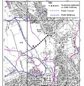 This sort of site map may be most familiar to people working in the ecology and environmental management sector. They can be produced with a variety of GIS software packages and are an essential part of ecological reports and site surveys. They are factual and precise, providing the necessary details to illustrate the site being discussed or the specifics of the work being proposed or reported.
Historic maps
Historic maps can give a fascinating temporal dimension when looking at issues such as environmental change. You can access historic maps via your local records office. But, be warned – they can become addictive! Digging into the history of a site that interests you can uncover fascinating information about the life and times of the people who have been connected to it. And finding images that you have permission to use can be a great way to grab the attention of readers.
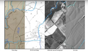
Image: Slide from a session on the historic extent of floodplain meadows by Dr Anthony Firth at the Floodplain Meadows Partnership Conference 2021. Available to watch by clicking the image.
Illustrated maps
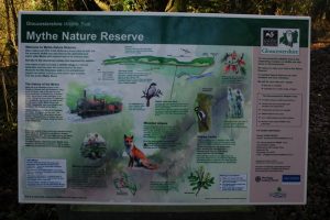
Image: Gloucestershire Wildlife Trust, Mythe Nature Reserve. © Copyright Philip Halling
This type of map is a more visually pleasing interpretation of the territory, commonly used on information boards at nature reserves. Their content may not be to scale and some details may be left out to make them easier for a public audience to understand and use. They may include illustrations of key species or other points of interest that can be found at the site. And routes will be clearly marked to help people understand what to expect as they explore.
By translating geographical information into a picture format for this type of map makes it easier for people to recall what they saw on the board. And, these days, it’s easy for people to snap a photo on their phone to refer to as they use the site.
Hand drawn or cartoon maps
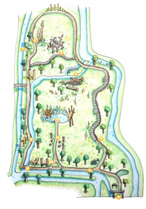
Image: Hampshire and Isle of Wight Wildlife Trust, Winnall Moors Story Trail Booklet
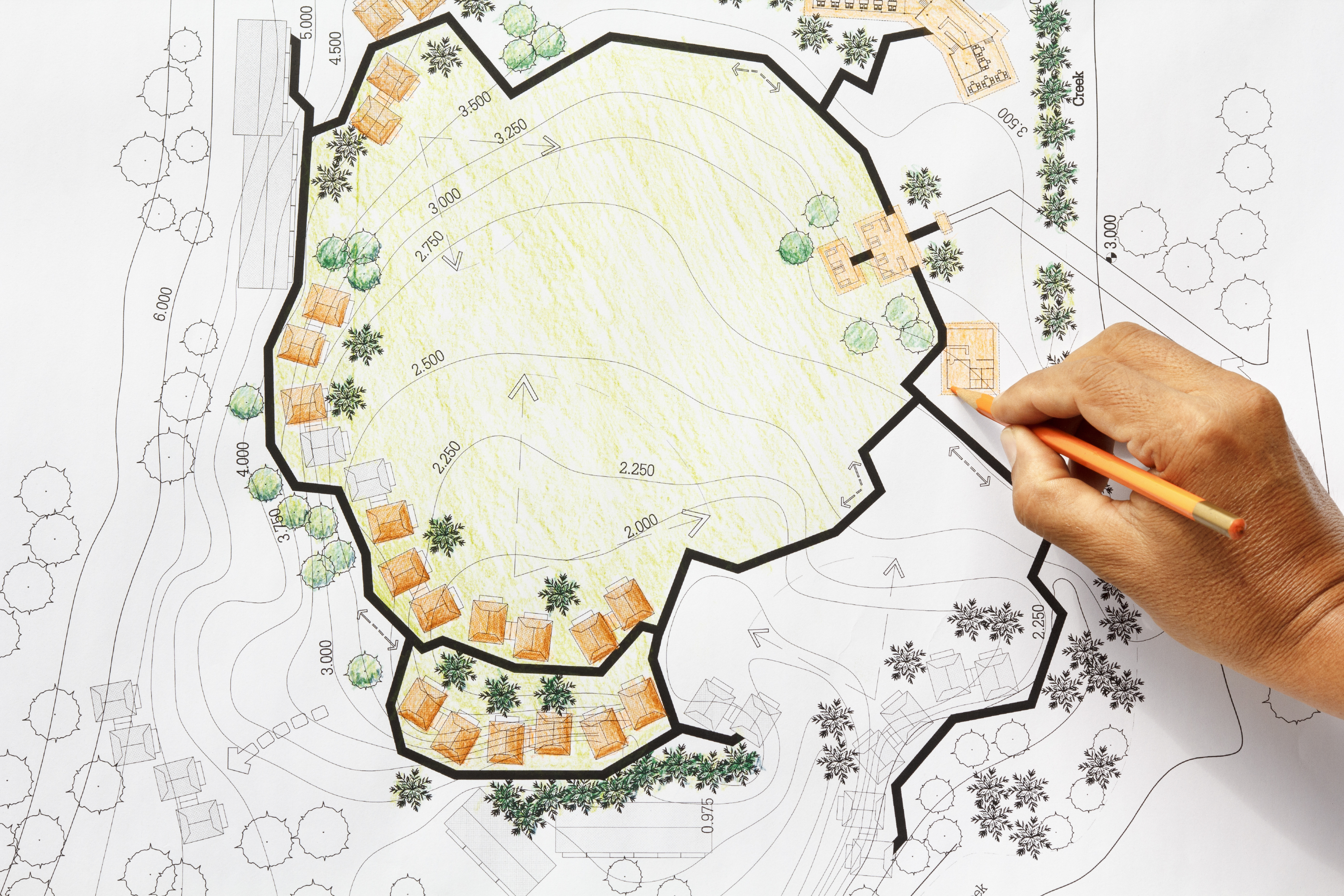
If you’re creating a piece of science communication for social media or a blog, it can be fun to create a simple, eye-catching map to go with it. This can quickly convey a sense of place for your reader and give some context for the topic you are talking about. These could be created digitally, or hand drawn and they don’t need to be as accurate as other map types. Think about what your map adds to your story – it could be more about the mood or culture of a location rather than a tool for navigation. Unlike the site information boards we looked at above, online communications are likely to be read by people far removed and unlikely to ever physically visit your location. So there may be a different balance to the features you include. There should be enough spatial information to locate your topic and enough illustration to tie your map to your story and allow your audience to imagine an experience of being there.
Interactive maps
So far we’ve looked at some different types of static mapping. Interactive web-based mapping is also an important part of communicating about environmental topics online. This could be an interactive site map with pop-up boxes at points of interest giving further details, or photographs of what you can see there. Or it could be a storymap that takes a more narrative route through a site, engaging audiences through the power of storytelling. You can create this type of map through services such as ArcGIS Storymaps or In Touch GIS Services.
Mapping your story
Maps are a fantastic tool for carrying information in a visual format and they can be as fun as they are informative. So next time you’re creating a piece of science communication, think about whether a map might help you connect with your audience. Consider the different mapping options and which one would give your message most impact. Including a map in your story can really help put your story on the map.
If you would like to find out more about science communication tools and best practice, you can find a recording and pdfs slides from my recent CIEEM webinar titled Science Communication for Ecologists and Environmental Managers. An associated infographic appears in the March 2022 issue of In Practice.
About the author:
Vicky is a PhD researcher investigating sustainable management of floodplain meadows at the Open University. She is also an illustrator with a keen interest in creative science communication. You can find out more about Vicky and her work at https://vickybowskill.com/
Blog posts on the CIEEM website are the views and opinions of the author(s) credited. They do not necessarily represent the views or position of CIEEM. The CIEEM blog is intended to be a space in which we publish thought-provoking and discussion-stimulating articles. If you’d like to write a blog sharing your own experiences or views, we’d love to hear from you at SophieLowe@cieem.net.